When creating charts in Excel, it is possible to swap the X-axis and the Y-axis. This makes things easier because you don't have to create a second chart.
Swap X and Y axes – just press a button
Using the Microsoft Excel program, you can swap the X-axis and the Y-axis by performing the following actions.
- Select the diagram by left-clicking with the mouse. The new “Diagram Design” area should now appear in the menu ribbon.
- Now click on this tab and then on the “Swap Row/Column” button. This way you don't have to go through the hassle of converting columns into rows and rows into columns.
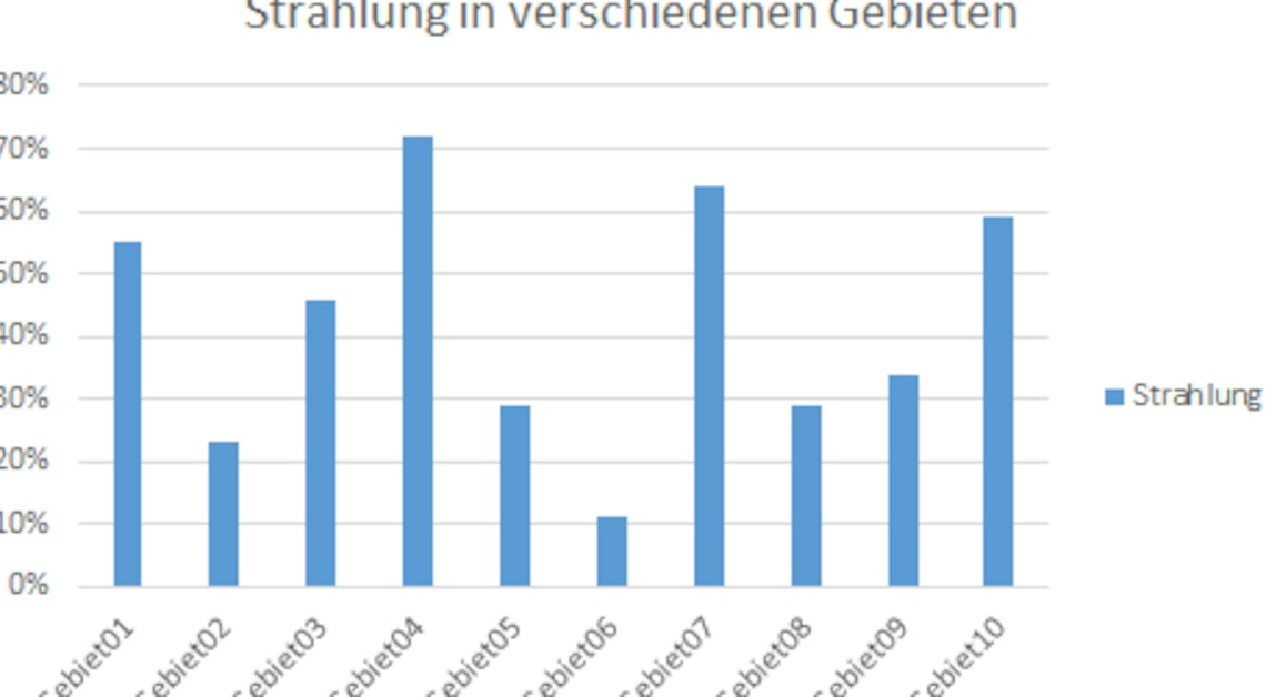
- If you press the tab several times, you can swap the rows and columns over and over again, but the color design will change as you switch. So first look at the diagram before switching (with blue columns only) to adjust the design if necessary.
After you change the view, the chart should look something like the second graphic.